Immofred
A web platform for private landlords in Germany to administrate their properties - with accounting, and service provider and tenant management.

My Role
I was employed as a student UX Designer to develop a user flow for a new feature, refine the user flow and interaction of the existing product, and redesign the visual interface.
The Process
The first step as a new team was to achieve a common understanding of the user and the objectives of the business. User interviews had already been carried out and three distinct users of the product had been identified. These users - their characteristics, behaviours and needs - were communicated and understood as a team through creating three user personas. The next urgent matter was to develop a user flow for a new process and translate these into user stories for implementation. Following this, the product manager/lead developer and I worked on refining the interaction of areas of the product through iterations of wireframes. Lastly, I redesigned the visual interface of the product (which was not implemented at that time). User testing of the new process and refined interaction was discussed but was not carried out during my time with the startup.
The Challenge
To enter a time-pressured startup in which the product was already on the market and pre-defined deadlines had to be met. In a short space of time, understand the users, context, current product and processes; implement UX design where no existing UX processes were in place; and contend with documents and artefacts in German with limited German knowledge.
Understanding the User
Personas
A detailed understanding of the user types of the product had been ascertained through interviews conducted prior to my arrival. This understanding was shared and I created three user personas based on these (one is shown below). The personas helped to achieve a common understanding of the user types, their characteristics, behaviours, pain points and needs.
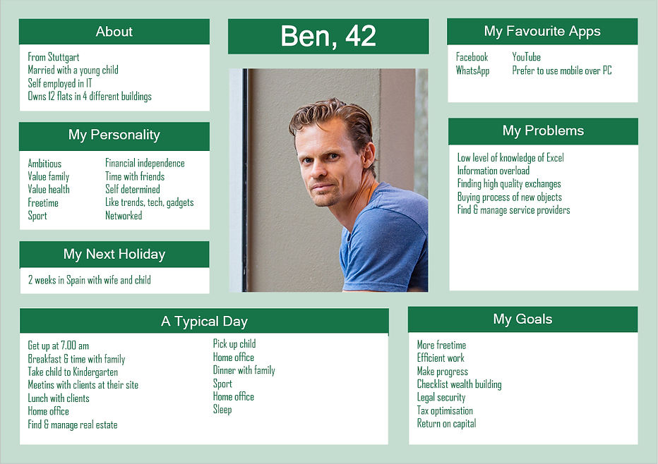
Key Insights from Personas
- Users were extremely busy people who needed the interaction and interface of the product to be as easy to use and understand as possible.
- Users found managing their properties time consuming, e.g. different service providers and tenants.
- Some users, especially those inexperienced in managing properties, found managing bookings, accounting and billing to be complex to understand and execute, and required a user friendly process.
- Some users managed multiple properties and needed an easy to understand overview of their properties and accounts.
Ultimately, the insights lead to the requirement for the product to be simple, easy to use, helpful, and not complex or overloaded with information. This became our key focus, and future activities were executed with this in mind.
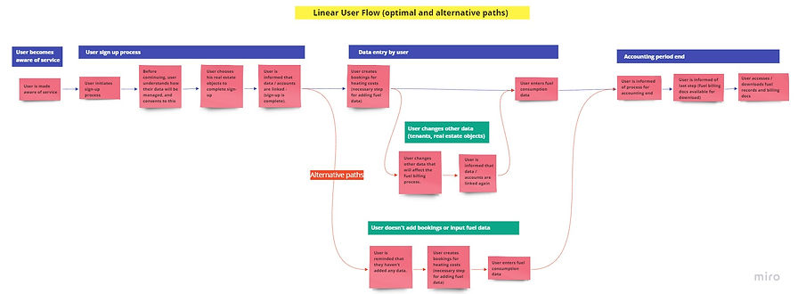


User Flow for New Process
My task was to think through and create a user flow that depicted the whole process, from onboarding through to the user downloading their fuel billing documents at the end of the accounting period. I began by working out a simple user flow process, which outlined the main optimal user flow and also alternative paths the user could take:
Using the simple user flow, I then worked out a more detailed user flow - i.e. one which showed which screens or dialogues needed to be created in order for the flow to happen, the anticipated user actions in response to the screens/dialogue, and how the system will respond to user actions. I believed this was necessary to obtain to full picture of the entire user flow. The displayed user flow below shows the process for the main optimal path (alternative paths are not shown):
The startup, Immofred, teamed up with the fuel service provider KALO, to provide an extra function to the users of the Immofred platform who also used KALO's services. The new function was to offer users the opportunity to link their properties in the Immofred platform to their KALO account, so that their fuel data and billing documents would be integrated and available in one place on the Immofred platform.
After discussing and amending this user flow with the product manager/lead developer, I then created the necessary wireframes for the screens/dialogues in Sketch. The Sketch wireframes, unfortunately, are not available for me to upload to this page.
The startup had a strict timeframe to implement (code) this feature, therefore this process was not tested with users first before implementation. To facilitate implementation, I translated the user flow and wireframes into user stories that could be developed.
After implementation, user testing of the process for the new feature was discussed but not executed during my time with the startup.
Redesign of Interface
Keeping in mind that the goal of the product was to be easy to use, simple, and not overloaded with information and complexity, I wanted a clean and uncluttered layout with less green (the corporate colour) to minimise distracting elements.
I felt that the main navigation in the existing design was long and cluttered, and showed too many options at one glance, therefore I wanted to make the main navigation and flow through the product simpler.

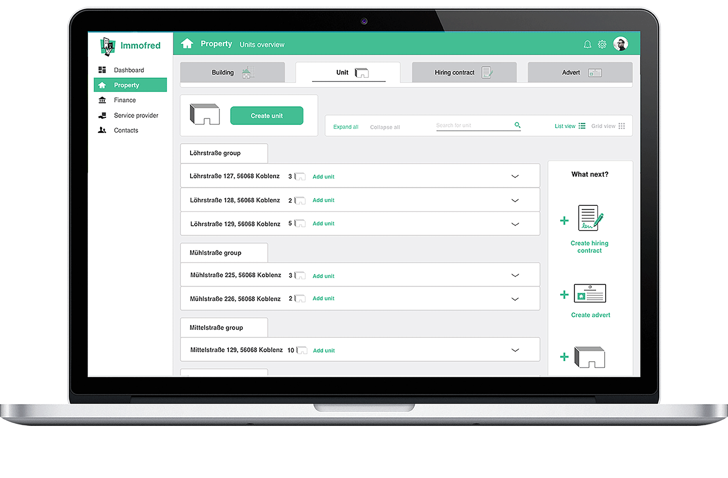
Screenshot of existing interface
To simplify the navigation, I filtered the categories down to the main functional areas of the product. Within each area, I wanted to have top tabs for the different sub-topics - I felt that the tabs kept the topics clear and distinct from each other. I also thought it was necessary to have a header that titled the page in question, to make it very clear to users where they are in the interface. I quickly sketched some raw designs and came to the one displayed below.

Believing that this main navigation and layout worked well, I then designed it in Sketch and iterated with feedback from the product manager/lead developer until a high fidelity version was created. To demonstrate the flow and interactivity, I linked the screens using InVision. A sample of the work can be seen in the animation below.
It was discussed that this redesign should be tested with users to see if the structure and navigation made sense to them. Due to the difficulty in deciding where to place certain information and elements during the redesign, it would have also been relevant to conduct card sorting exercises with users to discover their mental models of the system and understand where they would typically go to find certain information.