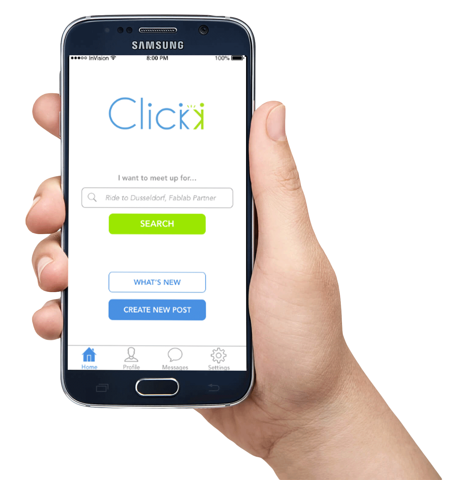
Click app
A social platform for the students of Rhine-Waal University that enables them to find, connect and meet with each other based on mutual interests.

Overview
The challenge was to execute a full scale UX project from research to conception to high fidelity prototype and testing. An additional challenge was to work in a multicultural setting in which all members were UX designers from interdisciplinary backgrounds.

The process
We began with user research to discover and understand the target user. To do this we conducted a survey and exploratory interviews. From the findings we developed a persona and a user journey map. Following this we defined the specification of the app which outlined the goals and functionalities of the system.
Product ideation took place through participatory design (design session with users) and team design. A low fidelity prototype was then created and evaluated through user testing. Following user feedback, a high fidelity prototype was created and tested again with users. We took an iterative approach - amending designs based on the participatory design session and user feedback.
User research
Survey
We used an online survey to quickly obtain relevant quantitative data and discover behaviour and opinion tendencies from a large number of users.
Key insights
As most students used smartphones, particularly iPhones, designing an iOS app would be suitable. Regarding hobbies, students had varied interests and most enjoyed meeting friends and socialising - which confirmed the potential of our project idea.


Interviews
We conducted 8 user interviews to understand the users’ experiences, habits, preferences, attitudes, tasks and goals. Questions included: "Why do you want to meet new people?", "What do you do about it?", "Think of a time you set out to meet new people. How did you do this? How effective was this?".
Key insights
-
Ownership of a smartphone and more than one social media app installed and used frequently
-
A desire to meet people with same interests and to do activities together
-
Interested in meeting new people, and exchanging experiences and cultures
-
Have hobbies and activities that they practice, or would like to practice in their free time
-
Live alone and would like to have friends/a partner to spend free time together
Persona
A persona was necessary to understand and clearly see how our user behaves and thinks, and understand what they desire and why. The persona allowed us to focus on our users' needs, check our progress regularly, make decisions and refine our work.

User journey map
We created a user journey map to show the user's desires and their experience of our app - before, during and after engagement. This showed the intersections between user expectations and system requirements, and the thoughts and emotional states of the user. The map demonstrated the potential for addressing user needs.

Specification
Goal of system:
To provide an effective and easy-to-use way for users to find and get in contact with other users based on similar interests.
Functionality:
1. Registration & profile
2. Login
3. Create new post
4. Edit your post
5. Delete your post
6. Search posts
7. Respond to post
8. Reply to a message
9. View another user’s profile
10. Block user
Ideation & design
Participatory design
In this small group session we asked users to sketch 4 key screens and provide a rationale behind their designs. This session allowed us to get feedback on the app's concept, and understand users' mental models and expectations. It helped us to ensure that the later design would be focused on the user expectations and needs.
Key insights
-
Profile, messages, post list, create post, search post should be visible on Home screen.
-
Posts listed in order of event date (not creation date).
-
Posts to have expiration.
-
User to see if they have previously viewed a post.
-
Button function on post to message post creator.
-
Minimalism, simple interface, necessary information only.


Team design - wireframing
Following the participatory design session, we reviewed and discussed the designs and explored wireframes of the key screens - taking into account the users' suggestions and making other important design decisions.
Key decisions
-
An ‘offers’ or posts based concept that users can browse and choose to contact.
-
Home screen featuring interest channels (e.g. sport, music, art). User taps to reach list of offers/posts within that interest, to add their own post & view their posts.
-
Floating bottom bar on all screens with access to Home (therefore, interest channels and posts), my Profile, Messages & Settings.
-
Messaging - viewer sends first message to post owner and suggests date and time to meet. Post owner responds and direct chat begins.


First user testing
Key insights
Generally, users managed to perform all tasks easily and comments were that the app was ‘straightforward’, ‘familiar’ and ‘easy to use’. Useful feedback was also received:
- Discard the interest channels on Home screen - it limits the way to search and create posts.
- Block other users directly within the chat and view a list of blocked users.
- See which messages are read/unread.
- See the post owner’s profile from the post details screen - to associate a face with a post.
- Visit post owner’s profile details from the post details screen.
The user testing at this stage focussed on verifing the app’s main functions, and seeing whether the app and its interactions met the user’s requirements and expectations. We developed a test that asked users to perform 8 tasks:
5. Edit your posts.
6. Respond to a message.
7. Delete your post.
8. Look through all recent posts.
1. Search for posts.
2. Respond to a post.
3. Add your own post.
4. Find your posts.

High fidelity design
At this stage, we incorporated the useful feedback from the first testing into a high fidelity prototype.
The goal of the testing at this stage was to verify the changes we made, and see whether the interaction and experience had improved. We also wanted to find out users' thoughts on the look and feel of the app. We developed a test that asked users to perform 9 tasks:
6. Respond to a message.
7. Delete your post.
8. Edit your profile.
9. Block a user.
1. Search ‘What’s new’.
2. Search using search bar.
3. View post details & respond.
4. View your posts & add a post.
5. Edit your posts.
Key insights
Users said the app was “clear and simple to navigate.” They liked the home screen because they found it “clear and easy to see what you can do on this page”. Useful suggestions from users included:
- Publish or Save button at the top when keyboard is covering the usual buttons.
- More informative profile section by adding more categories (eg. language, hobbies).
- Profile icons to lead to the users’ profiles when tapped.
